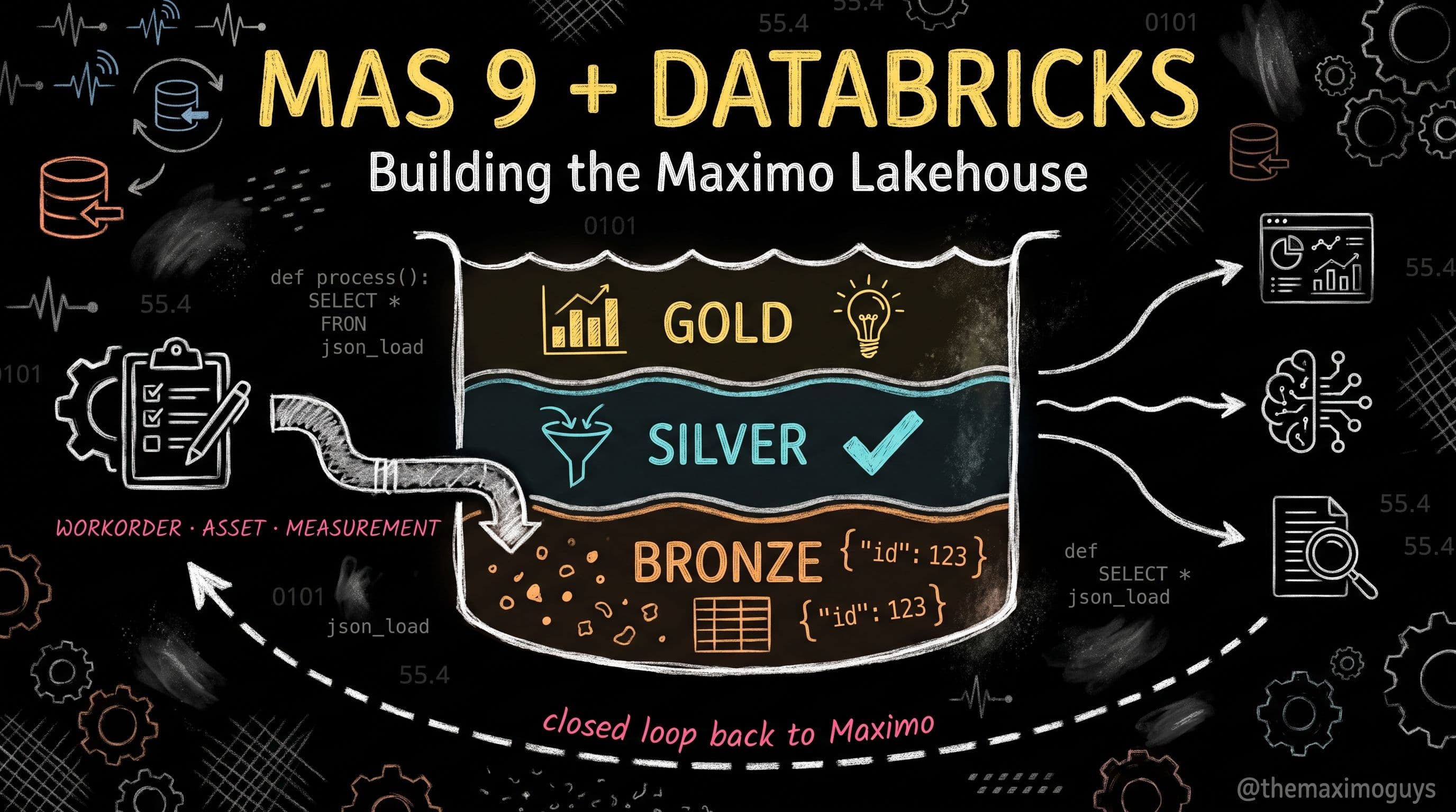
Five Analytics Use Cases: Reliability, Cost, Inventory, Backlog, and PM Compliance on the Gold Layer
🎯 Who this is for: Reliability and maintenance leaders who want to know exactly what a Databricks gold table can answer that their current Cognos report can't, data engineers who built Part 3's silver and gold tables and need the next layer of worked SQL, and BI developers connecting Databricks SQL to a Power BI or Tableau front end for a maintenance dashboard.
Series: Part 4 of 6 — MAS 9 + Databricks: Building the Maximo Data Lakehouse | Read time: 17 minutes
📖 The Gold Layer Was the Point
Part 3 of this series built silver.work_orders_enriched, silver.dim_asset, silver.inventory_demand, and silver.pm_effectiveness — the conformed, joined, meter-aware tables that turn raw Maximo extracts into something a business question can actually be asked against. It closed with two starter gold tables, gold.maintenance_cost_kpis and gold.asset_reliability_kpis, and a promise: five concrete use cases, each answering one named question a maintenance leader already asks in a monthly review, built on that same silver foundation.
This post keeps that promise. Every use case below is deliberately narrow — one gold table, one question, one piece of worked SQL — because Part 3 already made the case against a single sprawling "everything" gold table. None of these five use cases requires a new extraction pattern or a new silver join; they are all read from the tables that already exist. What's new here is the analytical layer on top: window functions for trend health instead of single-snapshot numbers, classification logic for inventory, aging buckets for backlog, and compliance-rate math for PM programs — the kind of query a Cognos report against the raw Maximo database struggles to express cleanly, but a Databricks SQL warehouse handles as an ordinary SELECT.
💡 Key insight: None of these five gold tables is impressive because of what it computes — MTBF, a cost rollup, an ABC classification, a backlog bucket, and a compliance percentage are not exotic math. They're valuable because they're built once, on conformed silver tables, and then trusted by every dashboard and every closed-loop alert that reads them. The value is architectural, not algorithmic.
📊 Use Case 1 — Reliability Trend Health, Not Just This Quarter's Number
The MAS-RELIABILITY series defines the three numbers that matter — MTBF (operating time ÷ failures), MTTR (repair time ÷ repairs), and availability (MTBF ÷ (MTBF + MTTR)) — and is explicit that a single snapshot value invites the wrong kind of management: "managing to improve MTBF" as a static target instead of watching whether it's actually trending up or down for a specific asset class. gold.asset_reliability_kpis from Part 3 already computes MTBF and MTTR per asset class, per site, per quarter. What it doesn't yet answer is the question a reliability engineer actually needs: is this asset class's reliability improving, holding steady, or quietly degrading over the last year?
That's a trailing moving average, and it's exactly what Databricks SQL window functions are built for — computing a value across a frame of rows relative to the current one, without a self-join or a Python loop.
CREATE OR REPLACE TABLE gold.reliability_trend_health AS
SELECT
  asset_class,
  siteid,
  reliability_quarter,
  failure_count,
  mtbf_days,
  mttr_hours,
  -- Trailing 4-quarter moving average — the trend, not the snapshot
  ROUND(AVG(mtbf_days) OVER (
    PARTITION BY asset_class, siteid
    ORDER BY reliability_quarter
    ROWS BETWEEN 3 PRECEDING AND CURRENT ROW
  ), 1) AS mtbf_trailing_4q_avg,
  ROUND(AVG(mttr_hours) OVER (
    PARTITION BY asset_class, siteid
    ORDER BY reliability_quarter
    ROWS BETWEEN 3 PRECEDING AND CURRENT ROW
  ), 2) AS mttr_trailing_4q_avg,
  -- Flag degradation: this quarter's MTBF meaningfully below its own trailing trend
  CASE
    WHEN mtbf_days < 0.85 * AVG(mtbf_days) OVER (
      PARTITION BY asset_class, siteid
      ORDER BY reliability_quarter
      ROWS BETWEEN 4 PRECEDING AND 1 PRECEDING
    ) THEN 'DEGRADING'
    ELSE 'STABLE_OR_IMPROVING'
  END AS trend_flag
FROM gold.asset_reliability_kpis;
The 15% threshold in that CASE expression — this quarter's MTBF falling more than 15% below the prior four quarters' average, deliberately excluding the current quarter from its own comparison baseline — isn't a universal constant; it's a starting point to tune against your own asset classes' historical volatility. What matters structurally is the pattern: compare the current period against a trailing window that excludes itself, so a single bad quarter shows up as a flag rather than quietly pulling its own baseline down with it. A pump asset class sitting at DEGRADING for two consecutive quarters is a different conversation than one bad month — it's a signal that a PM interval, a spare-parts quality issue, or an operating-condition change is worth investigating, tied directly back to the PM-effectiveness silver table from Part 3.
| Reliability signal | What it tells you | Where it comes from |
|---|---|---|
| MTBF trailing 4Q average | Whether failures are getting rarer or more frequent for this asset class, not just this quarter's count | gold.asset_reliability_kpis, windowed |
| MTTR trailing 4Q average | Whether repairs are taking longer — a storeroom, permit, or skills problem, not a reliability one | Same table, same window |
| DEGRADING flag | A concrete trigger for a reliability review, not a chart someone has to notice | Threshold comparison against the trailing window |
💡 Key insight: A single quarter's MTBF is a fact. Four quarters of MTBF, windowed against each other, is a signal. The difference between a Cognos report and this gold table isn't the underlying numbers — it's that the window function turns a series of facts into a trend an engineer can act on without eyeballing a chart and guessing.
💰 Use Case 2 — Maintenance Cost Rollups With Month-Over-Month Variance
gold.maintenance_cost_kpis from Part 3 already rolls up total cost, work order count, and average cost per work order by site, asset class, and month. The gap it leaves is the one every budget review actually asks: is this month's cost in line with what we expected, or is it running hot? Maximo's own KPI List portlet has answered a version of this question inside Manage for years — it displays Actual, Target, and Variance for a KPI, then colors the row green (safe), yellow (caution), or red (past the alert threshold), with a trend indicator showing whether the color is moving the right direction since the last reading. The gold-layer version of that same idea, computed with a window function instead of a manually configured portlet threshold, looks like this:
CREATE OR REPLACE TABLE gold.cost_variance_kpis AS
SELECT
  siteid,
  asset_class,
  cost_month,
  total_cost,
  work_order_count,
  avg_cost_per_wo,
  -- Prior month's cost, via a window offset instead of a self-join
  LAG(total_cost) OVER (
    PARTITION BY siteid, asset_class ORDER BY cost_month
  ) AS prior_month_cost,
  ROUND(
    100.0 * (total_cost - LAG(total_cost) OVER (
      PARTITION BY siteid, asset_class ORDER BY cost_month
    )) / NULLIF(LAG(total_cost) OVER (
      PARTITION BY siteid, asset_class ORDER BY cost_month
    ), 0),
    1
  ) AS mom_variance_pct,
  -- Band the variance the way the KPI List portlet colors Actual vs. Target vs. Variance
  CASE
    WHEN ABS(100.0 * (total_cost - LAG(total_cost) OVER (
      PARTITION BY siteid, asset_class ORDER BY cost_month
    )) / NULLIF(LAG(total_cost) OVER (
      PARTITION BY siteid, asset_class ORDER BY cost_month
    ), 0)) <= 10 THEN 'GREEN'
    WHEN ABS(100.0 * (total_cost - LAG(total_cost) OVER (
      PARTITION BY siteid, asset_class ORDER BY cost_month
    )) / NULLIF(LAG(total_cost) OVER (
      PARTITION BY siteid, asset_class ORDER BY cost_month
    ), 0)) <= 25 THEN 'YELLOW'
    ELSE 'RED'
  END AS variance_band
FROM gold.maintenance_cost_kpis;
LAG() is doing the same job here that a self-join against the prior month would do in a database without native window function support, and it's worth naming why the window version is the better choice beyond brevity: a self-join re-scans and re-joins the table, while a single windowed pass computes every row's comparison in one sequential sweep, which matters once this table is running against several years of monthly history across every site and asset class combination. Databricks' own 2026 guidance for its AI/BI metric views goes a step further, adding a built-in offset field specifically for period-over-period measures like this — the same pattern this hand-written LAG() expresses explicitly, available as a declared measure property for teams building on metric views instead of raw SQL.
| Variance band | Threshold | KPI List analog | Action |
|---|---|---|---|
| GREEN | ≤10% month-over-month swing | Actual within Target's safe zone | No action — normal cost variation |
| YELLOW | 10–25% swing | Between caution and alert value | Review at the next monthly cost meeting |
| RED | >25% swing | Past the alert value | Investigate immediately — often a single large work order or a parts price spike |
Tune the 10%/25% bands to your own site's historical cost volatility rather than copying them verbatim — a site with genuinely lumpy capital-adjacent maintenance work (a scheduled major overhaul landing in one month) will trip a naive threshold every time that overhaul cycle recurs, and a threshold that fires on a known, planned pattern trains people to ignore the alert. Where that's a real pattern, exclude planned major work orders from this specific rollup and roll them up separately — the same "match the cleansing effort to what the table needs" principle Part 3 applied to silver joins applies here to gold-layer thresholds too.
📦 Use Case 3 — Slow-Moving and Excess Inventory, ABC Crossed With XYZ
silver.inventory_demand from Part 3 already joins material-use transactions against inventory balances and purchase-order receipts. The Databricks Solution described in the source roadmap for this series names "obsolescence prediction — which parts are trending toward zero demand" as a use case Databricks enables beyond IBM's MRO Inventory Optimization SaaS product, and the classic technique for finding those parts — before reaching for a full ML obsolescence model — is a two-way classification most inventory teams already know by name but rarely implement consistently: ABC by consumption value, XYZ by demand variability.
ABC buckets parts by their share of annual consumption value using the Pareto principle — a small number of A-items typically account for roughly 80% of spend, B-items the next tier, and a long tail of C-items contributing very little individually. XYZ buckets the same parts by how predictable their demand is — X-items consume at a steady, forecastable rate, Y-items show moderate seasonal or lumpy variation, and Z-items are sporadic or one-off. Crossing the two tells you something neither axis tells you alone: an AZ part (high value, unpredictable demand) needs the most attention and the largest safety buffer, while a CX part (low value, steady demand) can run on a simple reorder point with minimal oversight.
CREATE OR REPLACE TABLE gold.inventory_classification AS
WITH item_stats AS (
  SELECT
    itemnum,
    siteid,
    SUM(annual_usage_qty * unit_cost) AS annual_consumption_value,
    AVG(monthly_usage_qty) AS avg_monthly_usage,
    STDDEV(monthly_usage_qty) AS stddev_monthly_usage,
    MAX(last_issue_date) AS last_issue_date,
    current_qoh
  FROM silver.inventory_demand
  GROUP BY itemnum, siteid, current_qoh
),
ranked AS (
  SELECT *,
    SUM(annual_consumption_value) OVER (
      PARTITION BY siteid ORDER BY annual_consumption_value DESC
    ) / SUM(annual_consumption_value) OVER (PARTITION BY siteid) AS cumulative_value_pct,
    stddev_monthly_usage / NULLIF(avg_monthly_usage, 0) AS coeff_of_variation
  FROM item_stats
)
SELECT
  itemnum, siteid, annual_consumption_value, current_qoh, last_issue_date,
  CASE
    WHEN cumulative_value_pct <= 0.80 THEN 'A'
    WHEN cumulative_value_pct <= 0.95 THEN 'B'
    ELSE 'C'
  END AS abc_class,
  CASE
    WHEN coeff_of_variation <= 0.5 THEN 'X'
    WHEN coeff_of_variation <= 1.0 THEN 'Y'
    ELSE 'Z'
  END AS xyz_class,
  -- Slow-moving / excess flag: on-hand stock, zero issues in 12 months
  CASE
    WHEN current_qoh > 0 AND DATEDIFF(CURRENT_DATE(), last_issue_date) > 365
    THEN TRUE ELSE FALSE
  END AS is_slow_moving_candidate
FROM ranked;| Class | Value tier (ABC) | Demand pattern (XYZ) | Typical action |
|---|---|---|---|
| AX | Top ~80% of spend | Stable, forecastable | Tight reorder point, min-max well-tuned, low safety stock needed |
| AZ | Top ~80% of spend | Sporadic, unpredictable | Highest attention — largest safety buffer, candidate for vendor-managed inventory or consignment |
| CX | Long tail of spend | Stable | Simple reorder point, minimal review cadence |
| CZ / slow-moving flag | Long tail of spend | Sporadic or dead | Obsolescence review candidate — cross-site transfer or disposal before reordering |
The is_slow_moving_candidate flag deliberately uses a blunt rule — stock on hand, no issue transaction in the trailing 365 days — because it's meant as a screening filter for a human review, not an automated disposal trigger. A part with zero issues in a year might be a genuinely dead SKU, or it might be a critical spare for a low-frequency, high-consequence failure mode that hasn't happened yet — the same distinction MAS-RELIABILITY's Part 2 makes about censored data biasing an MTBF estimate downward. Cross this flag against silver.dim_asset's criticality rating before recommending disposal; a CZ-classified spare tied to a criticality-1 asset is not the same disposal decision as a CZ part with no active asset link at all.
🗂️ Use Case 4 — Work Order Backlog Aging by Craft
Backlog is the metric most maintenance teams already track informally — "we're behind on PM's" or "the electricians are swamped" — but rarely measure with the precision that turns it into a scheduling decision instead of a vibe. The discipline that matters, and that most naive backlog queries get wrong, is scoping the count correctly: backlog should be ready-to-schedule work only — approved, no outstanding parts or permit block — not every open work order regardless of status. Maximo's own Work Queues concept, including the dedicated Safety Critical Backlog queue inside the Manage work-queue portlets, already draws this line inside the application; the gold-layer version needs to draw it the same way or the resulting weeks-of-backlog number overstates real scheduling pressure.
CREATE OR REPLACE TABLE gold.backlog_aging AS
WITH ready_backlog AS (
  SELECT
    wo.wonum,
    wo.siteid,
    craft.craft_code,
    wo.status,
    est.estlabhrs,
    DATEDIFF(CURRENT_DATE(), wo.changedate) AS days_in_backlog
  FROM bronze.maximo_workorder_raw wo
  JOIN silver.wo_labor_craft craft ON wo.wonum = craft.wonum
  JOIN silver.wo_estimates est ON wo.wonum = est.wonum
  WHERE wo.status IN ('APPR', 'WSCH')      -- approved and ready, not blocked
    AND wo.status NOT IN ('WMATL', 'WAPPR') -- explicitly exclude parts/approval-blocked work
),
craft_capacity AS (
  SELECT craft_code, siteid, weekly_capacity_hrs FROM silver.dim_craft
)
SELECT
  rb.siteid,
  rb.craft_code,
  SUM(rb.estlabhrs) AS total_ready_backlog_hrs,
  ROUND(SUM(rb.estlabhrs) / NULLIF(cc.weekly_capacity_hrs, 0), 1) AS weeks_of_backlog,
  SUM(CASE WHEN rb.days_in_backlog <= 14 THEN rb.estlabhrs ELSE 0 END) AS hrs_0_2_weeks,
  SUM(CASE WHEN rb.days_in_backlog BETWEEN 15 AND 28 THEN rb.estlabhrs ELSE 0 END) AS hrs_2_4_weeks,
  SUM(CASE WHEN rb.days_in_backlog BETWEEN 29 AND 42 THEN rb.estlabhrs ELSE 0 END) AS hrs_4_6_weeks,
  SUM(CASE WHEN rb.days_in_backlog > 42 THEN rb.estlabhrs ELSE 0 END) AS hrs_over_6_weeks
FROM ready_backlog rb
JOIN craft_capacity cc ON rb.craft_code = cc.craft_code AND rb.siteid = cc.siteid
GROUP BY rb.siteid, rb.craft_code, cc.weekly_capacity_hrs;| Weeks of ready backlog | Interpretation | Typical response |
|---|---|---|
| 3–5 weeks | Healthy — enough queued work to schedule efficiently without idle crews | No action; this is the target range most published maintenance benchmarks treat as normal |
| 6+ weeks | Aging — work is piling up faster than the craft can execute it, and equipment risk accumulates the longer it waits | Escalate: overtime, contractor support, or a look at whether PM frequency is generating more corrective work than the crew can absorb |
| Under 2–3 weeks | Starved — a craft with too little queued work is itself a planning problem, not a success | Check whether planning/scheduling is falling behind on approving and estimating new work |
The hrs_over_6_weeks bucket deserves specific attention beyond the total, because industry deferred-maintenance research puts a real number on why aging backlog compounds rather than just sitting still: unaddressed deferred maintenance tends to compound at roughly 7% annually as components that would have been a simple repair degrade into more extensive failures. A backlog table that only reports a total weeks-of-backlog number hides which portion of that backlog is six-plus weeks old and actively compounding versus which portion is two weeks old and perfectly normal queue depth — the bucket breakdown is what turns "we have 8 weeks of backlog" into "we have 8 weeks of backlog, but 5 of those weeks are less than two weeks old and only 1 week's worth is aging past six weeks," which is a very different planning conversation.
💡 Key insight: A single weeks-of-backlog number tempts a planner into treating 8 weeks of freshly-approved, well-understood work the same as 8 weeks that includes aging, at-risk work orders. Bucket it by age, not just by total, or the metric hides exactly the signal — compounding risk on old work — it exists to surface.
✅ Use Case 5 — PM Compliance Rate
PM compliance answers a narrower and more specific question than "are we doing our PMs": of the preventive maintenance work scheduled to be completed in a given period, what percentage was actually completed within its compliance window — not just completed eventually, but completed close enough to its due date that the PM is doing the job it's scheduled to do. Published maintenance benchmarks treat roughly 85% as the practical floor: PM compliance is widely regarded as one of the most predictive leading indicators of future reliability, and reactive failure rates tend to climb sharply once compliance drops meaningfully below that threshold.
CREATE OR REPLACE TABLE gold.pm_compliance_kpis AS
WITH pm_due AS (
  SELECT
    pm.pmnum,
    pm.assetnum,
    a.assettype AS asset_class,
    pm.siteid,
    pm.frequency,
    pm.duedate,
    pm.actual_completion_date,
    -- Compliance window: completed within 10% of frequency, before or after due date
    DATEDIFF(pm.actual_completion_date, pm.duedate) AS days_variance,
    (pm.frequency * 0.10) AS allowed_variance_days
  FROM bronze.maximo_pm_raw pm
  JOIN silver.dim_asset a ON pm.assetnum = a.assetnum AND a.__is_current = true
  WHERE pm.duedate BETWEEN DATE_TRUNC('month', CURRENT_DATE()) - INTERVAL 3 MONTH
    AND CURRENT_DATE()
)
SELECT
  asset_class,
  siteid,
  DATE_TRUNC('month', duedate) AS due_month,
  COUNT(*) AS pms_due,
  SUM(CASE
    WHEN actual_completion_date IS NOT NULL
      AND ABS(days_variance) <= allowed_variance_days
    THEN 1 ELSE 0
  END) AS pms_compliant,
  ROUND(100.0 * SUM(CASE
    WHEN actual_completion_date IS NOT NULL
      AND ABS(days_variance) <= allowed_variance_days
    THEN 1 ELSE 0
  END) / NULLIF(COUNT(*), 0), 1) AS compliance_pct,
  CASE
    WHEN 100.0 * SUM(CASE
      WHEN actual_completion_date IS NOT NULL AND ABS(days_variance) <= allowed_variance_days
      THEN 1 ELSE 0 END) / NULLIF(COUNT(*), 0) >= 85 THEN 'ON_TARGET'
    ELSE 'BELOW_THRESHOLD'
  END AS compliance_flag
FROM pm_due
GROUP BY asset_class, siteid, DATE_TRUNC('month', duedate);
The allowed_variance_days expression — 10% of the PM's own frequency — matters more than it looks, because a fixed variance window (say, "within 5 days") treats a weekly PM and an annual PM identically, and they shouldn't be. A weekly PM completed 5 days late has essentially skipped a whole cycle; an annual PM completed 5 days late is well within normal scheduling noise. Scaling the allowed variance to the PM's own frequency is what makes the compliance percentage comparable across a fleet that mixes short-interval and long-interval PM tasks, the same way Part 3's PM-effectiveness silver table joined against a 90-day lookback window scoped to the question being asked rather than a single fixed number applied everywhere.
| Compliance level | Signal | Typical response |
|---|---|---|
| ≥95% | Strong program discipline | Maintain; consider whether some low-value PMs are candidates for frequency reduction |
| 85–95% | Acceptable, watch for drift | Monthly trend review; check whether any single asset class is dragging the average down |
| <85% | Below the threshold most benchmarks associate with rising reactive failure rates | Escalate — planning capacity, parts availability, or crew staffing is the usual root cause, not PM design itself |
🔔 Closing the Loop — From Gold Table to Maximo Action
Every use case above produces a table a BI tool can read directly — connect Power BI or Tableau to a Databricks SQL warehouse endpoint and each of these five gold tables becomes a dashboard tile with almost no additional modeling work, because the aggregation and business logic are already applied. That's the payoff of gold-layer design done right, and it's a legitimate stopping point for a first build. But this series' index post names the pattern that actually changes behavior, not just visibility: closed-loop — a threshold breach in one of these tables should trigger an action back inside Maximo, not just a color change on a chart someone has to remember to check.
Databricks SQL Alerts, generally available as of 2026, are built for exactly this: a scheduled query against any of these gold tables, evaluated on a cadence, that fires a notification — or, via a webhook action, an HTTP call — the moment a condition is met. Pointed at gold.backlog_aging for weeks_of_backlog > 6, or at gold.pm_compliance_kpis for compliance_flag = 'BELOW_THRESHOLD', or at gold.reliability_trend_health for trend_flag = 'DEGRADING', the alert becomes the mechanism that calls Maximo's REST API to create a service request, bump a work order's priority, or add an asset to a Health work queue — the same closed-loop shape MAS 9.1's own Operational Dashboard KPI Value cards use natively when they link a KPI directly to a Maximo work queue, except extended past Maximo's own data to whatever the Databricks gold layer can see.
| Trigger condition | Gold table | Maximo-side action |
|---|---|---|
| trend_flag = 'DEGRADING' for 2+ consecutive quarters | gold.reliability_trend_health | Create a reliability-review service request; flag the asset class in Maximo Health |
| variance_band = 'RED' | gold.cost_variance_kpis | Notify the site maintenance supervisor; flag for the monthly cost review |
| is_slow_moving_candidate = TRUE with high criticality | gold.inventory_classification | Route to a storeroom review queue rather than auto-reorder |
| weeks_of_backlog > 6 | gold.backlog_aging | Create an overtime/contractor-support request for that craft |
| compliance_flag = 'BELOW_THRESHOLD' for 2+ months | gold.pm_compliance_kpis | Escalate to planning/scheduling; audit crew capacity against PM plan volume |
💡 Key insight: A dashboard is where a human interprets a trend. An alert is where the platform acts on a threshold without waiting for a human to notice. Build both — the dashboard for root-cause investigation, the alert for the cases where waiting for someone to check a chart is itself the risk.
⚠️ Common Mistakes Building These Five Use Cases
- Reporting a snapshot instead of a trend for reliability and cost. A single quarter's MTBF or a single month's cost tells you where you are, not where you're headed — window functions computing a trailing average are what turn a fact into a signal worth acting on.
- Classifying inventory by value alone, skipping demand variability. ABC without XYZ tells you what's expensive; it doesn't tell you which expensive parts also need a larger safety buffer because their demand can't be forecast tightly.
- Counting every open work order as backlog. Work blocked on parts, permits, or approvals isn't ready-to-schedule work — including it inflates weeks-of-backlog and points a planning conversation at the wrong root cause.
- Using a fixed variance window for PM compliance across mixed frequencies. A flat "within 5 days" rule treats a weekly PM and an annual PM as equally tolerant of delay, when they aren't — scale the allowed variance to the PM's own frequency.
- Building the gold table and stopping at the dashboard. A chart nobody checks regularly doesn't change behavior — pair each threshold with a Databricks SQL Alert that calls back into Maximo, or the gold layer never earns back the effort it took to build.
- Copying threshold numbers verbatim instead of tuning them. The 85% PM compliance floor, the 6-week backlog-aging line, and the 10%/25% cost-variance bands in this post are industry starting points, not universal constants — validate them against your own site's historical volatility before wiring them to an automated alert.
🔧 Practical Notes Before Part 5
- Build the reliability and cost use cases first. They read directly from Part 3's existing gold tables with no new silver joins required, making them the fastest of the five to stand up and validate against a Cognos number you already trust.
- Get one craft's backlog aging right before rolling out fleet-wide.
silver.dim_craft's weekly capacity figure has to be genuinely accurate for the weeks-of-backlog math to mean anything — a capacity number that's stale or aspirational produces a backlog metric nobody trusts. - Treat PM compliance threshold breaches as a planning conversation, not a technician performance metric. Compliance below 85% is almost always a capacity, parts, or scheduling problem — treating it as an individual accountability issue misses the actual lever.
- Scope your first Databricks SQL Alert narrowly. Pick the one use case where a delayed human notice actually costs money or safety margin — backlog aging past 6 weeks on a safety-critical craft is a reasonable first alert to wire end-to-end before automating all five.
- Part 5 picks up where these use cases hit a wall. All five here are descriptive and rule-based — a threshold, a window function, a classification. When a use case needs a genuine prediction instead of a rule (which asset will actually fail, which part will actually go obsolete), that's the custom-ML-versus-Maximo-Predict decision Part 5 works through.
Key Takeaways
- All five use cases read from Part 3's existing silver and gold tables — no new extraction pattern or silver join is required, which is the payoff of building the conformed dimensions and enriched work-order table correctly the first time.
- Reliability and cost need trend analysis, not snapshots — Databricks SQL window functions turn "this quarter's MTBF" into "is this asset class degrading," which is the question that actually drives a reliability decision.
- Inventory classification needs both value (ABC) and demand variability (XYZ) — crossing the two identifies which expensive parts also carry unpredictable demand and need the largest safety buffer, not just the closest watch.
- Backlog aging must be scoped to ready-to-schedule work and bucketed by age, not counted as every open work order — a single weeks-of-backlog number hides the compounding risk sitting in the six-plus-week bucket specifically.
- PM compliance below roughly 85%, and any threshold breach across these five gold tables, is worth wiring to a Databricks SQL Alert that closes the loop back into a Maximo work order or service request — a dashboard nobody checks doesn't change behavior; an alert that calls the REST API does.
References
- Databricks — Automate Data & KPI Monitoring with SQL Alerts
- Databricks on AWS — SQL Alerts
- Databricks on AWS — Window Functions
- Databricks on AWS — Advanced Techniques for Metric Views
- OxMaint — Maintenance KPI Dashboard: The 15 Metrics That Drive Operational Excellence
- OxMaint — Maintenance KPI Dashboard: What Managers Should Track Weekly
- LinkedIn — Maximo Minute: MAS 9.1 Dashboards, From KPI to Action in One Click
Series Navigation
| Previous: | Part 3 — Building the Asset Lakehouse |
|---|---|
| Next: | Part 5 — Custom ML vs. Maximo Predict |
About TheMaximoGuys: We help Maximo developers and teams navigate the move to MAS 9 with practical, no-hype guidance grounded in how the platform actually behaves.
Published by TheMaximoGuys | July 2026

 Surendra Katta